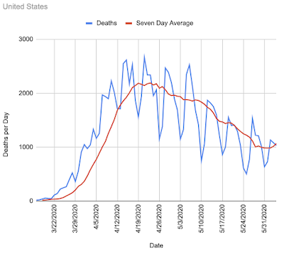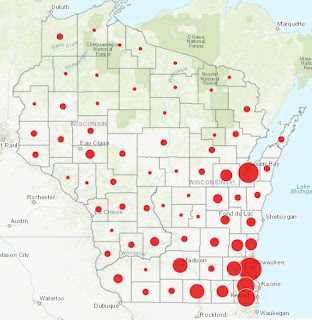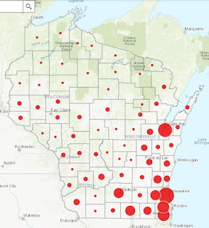
The death rate in the United States showed an approximately exponential growth rate through the middle of April to just over 2000 deaths per day, then an approximately linear decline through the rest of April and May to the present rate of about 1000 deaths per day. The curve seems to be curving back up now which could indicate a second wave will be occurring. The CDC changed the colors of the graph a few days ago to blue. Not sure why. Maybe it is to help people with red green color blindness. They also modified the format of the state data on the website so it is now harder to parse. This graph is from May 21: This is an average of deaths per day for the past 11 days ending June 4, 2020. New York 101 Illinois 82 New Jersey 81 Massachusetts 71 California 66 Pennsylvania 66 Ohio 39 Maryland 39 Michigan 37 Florida 34 Connecticut 32 Georgia 29 Virginia 26 Indiana 24 Texas 23 Minnesota 21 North Carolina 19 Arizona 19 Louisiana 18 Mississippi 16 Colorado 16 Rhode Island 15 Iowa 14 Wisconsi...
